Product Design | UX Research | Product Strategy
PORTAL PLUS

Overview
HPE Financial Services (HPEFS) provides technology & financing solutions across the globe, helping organizations transform their technology environments.
The Portal Plus project for Hewlett Packard Enterprise Financial Services (HPEFS) was a digital transformation initiative aimed at completely reimagining customer interaction by revamping a legacy system into a best-in-class customer experience.
This project focused on UX Research and UX & UI Design, resulting in significant improvements in user experience and process efficiency.
Role:
Lead UX Designer
Phase 1: Design & market research, competitor analysis, documentation, ideation, and blue-sky prototyping.
Phase 2: Stakeholder workshop facilitation, client handling, requirement gathering, ideation, prototyping, usability testing, and presentations.
Methods:
Heuristic evaluation, secondary research, competitive analysis, user interviews, card-sorting, information architecture, prototyping
Tools: Zoom, Figma, Miro
Timeline: 9 months - 2 phases
In Collaboration with:
Developers, Designers, Biz, operation & strategy Stakeholders
Key Outcomes
-
60% reduction in the number of steps required to complete key tasks.
-
7 business channels consolidated into one streamlined platform.
-
Delivered over 500 development-ready visual designs, ensuring a seamless transition to the new system.
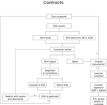
The Problem Space
The original HPEFS platform was a fragmented legacy system, which created a frustrating experience for users who had to navigate across multiple channels.
The system was disjointed and the process was manual. There was no one place where the users could go to find the information.
It was all through excel sheets, and phone calls and the portal only provided a place to see and track their final invoice.
The Objective
To transform the customer experience by redesigning the HPEFS platform, improving usability, and aligning the system with contemporary design standards to enhance both efficiency and satisfaction.
Process we followed
.png)
Research
Empathize, Contextualize, and Strategize: Insights Through Design Thinking Workshops
A comprehensive and collaborative approach was adopted for the project enabling wholesome participation from the stakeholders to get to the crux of the problem, facilitating feedback and iteration at every step.
We began by identifying the key pain points and inefficiencies within the current system.
-
Led Design Thinking workshops in NYC & Dublin to collaborate with stakeholders and assess business needs.
-
Engaged stakeholders to analyze the business model, market segment, and portal workflows.
-
Conducted heuristic evaluation & benchmarking to compare the system with industry best practices.
-
Developed personas & journey maps to identify user frustrations and process gaps.

Key Insights
Fragmentation
Users had to navigate across different channels to complete tasks. The business also had internal silos making it harder to track and causing internal dropoffs
Cognitive Overload
Users experienced cognitive overload due to poorly organized information and lack of feedback mechanisms within the portal.
Operational Inefficiency
A slow, manual process across global markets resulted in prolonged turnaround times and user dissatisfaction.
A need for a streamlined, user-centric design was identified to reduce steps, simplify processes, and improve overall satisfaction.
Sensemaking and Ideation
Buliding up to the final solution
Our approach prioritized simplicity and seamless interaction, developing solutions in scalable phases. We created personas, user flows, and a combined journey map, progressing to wireframing. Iterative refinements ensured a polished, intuitive experience.
Many iterations and reformations to the idea took place during this, evolving the concept and smoothing over any gaps that were identified.

-
Taxonomy & Hierarchy: Restructured key terms and processes for a more fluid user experience.
-
Card Sorting & User Flows: Conducted closed card sorting to improve categorization and created user flows for each section.
Developed personas, empathy maps, service and detailed user journeys to identify pain points and optimization opportunities.
Multiple journeys were created which were later consolidated into a single end-to-end journey


An End-to-End Journey Map unified all user flows, streamlining workflows, reducing silos, and prioritizing key journeys.
Before
After


Ideation and Iteration
From Sketch to Screen: Iterative Prototyping for Enhanced Usability

Information Architecture
High Fidelity Prototypes
Tradeoffs
Strategic Decisions
-
We chose to consolidate 7 channels into one rather than improve each because the fragmentation itself was the problem, not the individual experiences.
-
We deprioritized mobile-first in Phase 1 based on user behavior data showing 90%+ desktop usage among this enterprise user base.
-
We scoped Phase 1 to core task completion over visual polish, prioritizing development-readiness and stakeholder confidence over a fully refined UI, which we iterated in Phase 2.
Final Design
Portal Plus: From Complexity to Clarity – A Complete Redesign
The final solution was a fully revamped Portal Plus, which significantly reduced complexity, improved user interface design, and consolidated multiple processes into a single, intuitive platform. This revamped portal tackles the earlier identified issues of information overload, multiple usage streams, no contextual data, lack of feedback, and ambiguity. Our final deliverable included over 500 individual frames and was the product of countless previous iterations. This project was a great example fo stripping down and starting from scratch with how a group of designers were able to bring transform an initial idea to a polished final product.

-
Dashboard with space for displaying upcoming features and promoting cross-selling
-
Provides an overview of portal activities without requiring deep exploration.
-
Familiar interface ensures a seamless user experience throughout the process
-
Timeline view of agreements allowing users to zoom in & explore specific years.
-
In-depth understanding of milestone details within each year
-
At-a-glance overview of agreement details and quick call-to-action options.
-
Reduces intellectual and cognitive load for users
Ability to group and view data in different ways for quicker decision-making.
.png)
-
Dedicated invoice management space with data visualization
-
Historic transaction trends displayed for better financial insights
-
Data table and Reminders provide essential, contextual information for efficient financial management
.png)
-
Upcoming expenses showcased for future monetary prediction and management
The transformation transcended the portal's experience, taking it from frustration to ease of use and comfort. The final product included detailed visual designs and high-fidelity prototypes that were ready for development, ensuring a smooth transition and positive user adoption.

Reflection
Collaboration with stakeholders and continuous feedback were key to refining the final product. With a small team of seven designers, we transformed an initial idea into a polished web application.
Our iterative approach kept the design aligned with user needs and business goals, emphasizing the integration of UX research with UI design for both usability and aesthetics.
Lesson learned: Earlier user testing could have helped catch usability issues sooner.
The project was a success, showcasing the power of collaboration and iterative design.